FINAL SELF-PORTRAIT TRIPTYCH (& IMAGES)


CLOSENESS/ TIGHT APERTURE: I shot everything between 50-70mm to invoke a sense of intimacy, connection, and closeness. I also did this so that the photos did not seem self-isolating since I would have had vignetting around the sides due to my lighting.
BLACK & WHITE: I wasn't going for a flashy and colorful vibe, but more of a rugged, serious vibe. I've been really into Wet Plate and Tintype recently, so to a degree, I was trying to mimic the style--minus the vignetting/sepia.
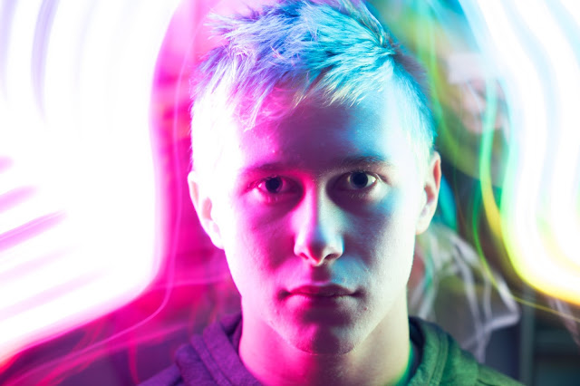
HARSH CONTRAST/ HIGHLIGHTS: Going off of the last one, this just further exaggerates some of the texture and I think looks really good. Also side note--the original photos are in color with the warm orange light on the left and the cooler blue on the right (the warm light is always in the direction of where I'm facing with the exception of one or two).
CLARITY STRENGTHENED: I believe this helps to bring in the viewer--It adds depth. It also establishes a nice foreground and background. Again, also in-line with the others, it's to show a more calloused, rough, exposed, worn-down look (as if I just finished a climb or ascent).
ZERO BLACK OFFSET/ CLEAR: This is not necessarily something I emphasize or denounce, I just really don't like black offset on the curves. In my opinion it degrades/ takes away from the photo.
BLURRY BACKGROUND: This keeps the subject pretty obvious and open to broader interpretation. The shadows also look really good.
CLIMBING ROPE: This is key to the overall look or "grime" to the photos. Since I'm a climber and alpinist It's pretty much a necessity. This could also be described as a coat (since it's over my shoulders), as it is who I identify as.
VARIOUS TRADITIONAL CLIMBING GEAR: They look really cool in the light and are meant to mimic some of the earlier work of climber Tom Frost and his famous image of Yvon Chouinard the founder of Patagonia-- It's a climbing company, not an apparel company!
CLIMBING HAMMER: Although we don't typically use them, it goes back to the roots of climbing and its culture that was born--when it was introduced to the U.S--in the Yosemite Valley.
SERIOUS--BUT NOT TOO SERIOUS: I was trying to keep it serious just to reflect what I'd look like coming off a mountain or after a hard day of climbing, but the harsh contrast might have added in making them a little to serious.
NO PHOTOSHOP ONLY LR: This is just a personal thing, there were no major errors in the photos, as I almost always shoot much longer as opposed to editing longer. Plus just keeping with some of my principles in photography since I do a lot of landscape work, I try and keep it real and as accurate as I can.
ARTIST STATEMENT
BACKWARD LOOKING 2/8: I first established the backdrop using a piece of white butcher paper held up with gaff tape. I then had to get chairs to raise my tripod so I could get the desired angle. For my camera setup, I used a remote shutter via an app that was set on a 10 photo burst. For lighting, I used the ikea leds I have in conjunction with the warm hallway light. The leds were hastily gaff taped to my tripod, along with the camera itself since it was leaning forward. Post processing is pretty straight forward, import everything, weed out the bad and the keep the good and then head over to LR. IN LR I immediately convert everything to DNG to preserve the development if I need to go back for whatever reason. After that I typically spend a couple hours finding just the right adjustments for each photo. Luckily, since there all pretty similar, I worked on one and applied that preset to the rest. I did however do a fair amount of tweaking for each one after that.
After importing all my work, I realized that my metadata/calibration presets were super messed up for whatever reason. I was pretty pissed since I put a lot of work into the photos, but I was able to successfully mend the issue by manually going in and adjusting the calibration preset meticulously.
INWARD LOOKING 9/10: First off, I'm really, really, really happy with results. I really like how sharp and revealing the photos are which I've had difficulty with in the past. They're not flat! These photos have depth to them which I have also struggled with in some of my personal work--however part of the problem was the metadata/calibration problem that I finally resolved since its all shot in RAW.
It ended up being exactly how I wanted it with the exception of being a little more serious than I had planned.
OUTWARD LOOKING 21/26: Most likely, my rigging was a bit more perfectionistic as that is one of my traits. Additionally, I have to believe I spent a lot more time tweaking and adjusting as opposed to just taking the shot. I have to be careful not to set my standards at the level of some of the professionals I'm inspired by such as: Chris Burkard, Renan Ozturk, Jimmy Chin, Cory Richards, and of course Ansel Adams.
I hope people see the sense of culture and identity i'm trying to convey in these photos as our community is surprisingly large and unique, yet often overlooked.
FOWARD LOOKING 37/39: I wish I had a lot more time for photography. I really enjoy shooting and developing, but being a college bound senior, I'm extraordinarily busy.
Next semester I really want to work on depth and a sense of 3rd dimension as opposed to more flat, less exciting work.


Comments
Post a Comment